In the high-octane theater of global aesthetics, where colors are crowned like royalty and trends shift with the speed of a digital scroll, Pantone has executed its most radical maneuver. For 2026, the global authority on color has bypassed the neon surges and the moody jewel tones of yesteryear to settle upon a whisper. PANTONE 11-4201 Cloud Dancer is the Color of the Year, a “lofty,” ethereal off-white that feels less like a pigment and more like a collective exhale in a world that has forgotten how to breathe.
As we stand on the precipice of a new design era, Cloud Dancer arrives as a visual reset. It is the aesthetic equivalent of a “Do Not Disturb” sign, favoring clarity over overstimulation. To the uninitiated, it appears to be simply white. To the connoisseur, it is the cornerstone of “Quiet Power.”
The Psychology: A Visual Reset
Why has the Pantone Color Institute, led by the visionary Leatrice Eiseman, chosen a shade that resides at the very edge of the spectrum? The answer lies in our collective exhaustion. We are living in an age of “polycrisis” and digital saturation. Cloud Dancer is a response to the “sensory overwhelm” of the 2020s.
“Cloud Dancer is a conscious statement of simplification. It is designed to help us hear our inner voices amidst the mechanical cacophony of AI and 24-hour connectivity. It represents a ‘lofty’ perspective looking upward, toward the clouds, seeking a sense of lightness that counteracts the heavy realities of the modern world. It is the color of potential, a literal blank slate that invites us to imagine what comes next”, says Leatrice Eiseman.
The Great Design Schism
The announcement of Cloud Dancer has sparked a delicious scandal in the hallowed halls of design. The industry is currently split into two camps, creating a tension that only makes the color more intriguing.
On one side, the Provocateurs on platforms like Medium and Wallpaper, argue that white is a “cop-out.” They claim that after years of “Millennial Pink” and “Brat Green,” choosing a neutral is a step backward. They argue that the world is moving toward dirty neutrals like earthy terracottas, tobacco, and moss green, and that Cloud Dancer is “plain toast” in a world that wants spice.
On the other side stand the Purists and Luxury Savants. High-end brands like Domkapa and Mandarin Oriental view Cloud Dancer as the ultimate luxury tool. For them, this isn’t an absence of color; it’s a “scaffolding” that allows craftsmanship, natural materials, and light to become the true protagonists. In the world of luxury, white isn’t basic; it’s a flex. It suggests a space so curated and a life so disciplined that “clutter” (both visual and mental) has been banished.
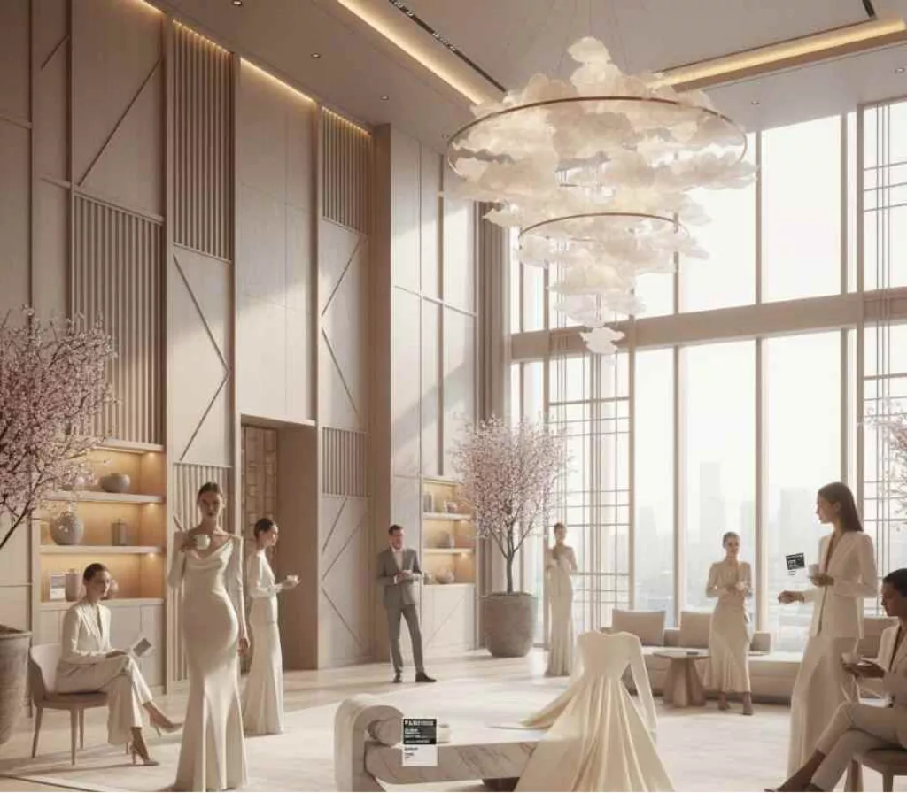
Interior Trends: The Rise of “Japandi 2.0” and Tactile Minimalism
In the realm of Architecture & Interior Design, Cloud Dancer is ushering in a warmer, more humanized version of minimalism. We are moving away from the cold, clinical ‘Dentist Office’ white of the 2010s and toward something far more organic.
-
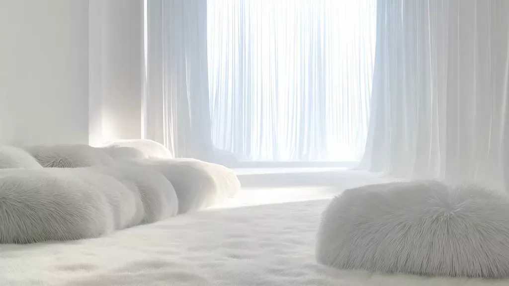
- Tactile Layering: The secret to mastering Cloud Dancer in the home is texture. Because the hue is so subtle, the eye looks for depth in the weave of the fabric. Expect to see an explosion of white-on-white layering: heavy bouclé sofas paired with raw linen curtains and hand-knotted wool rugs.
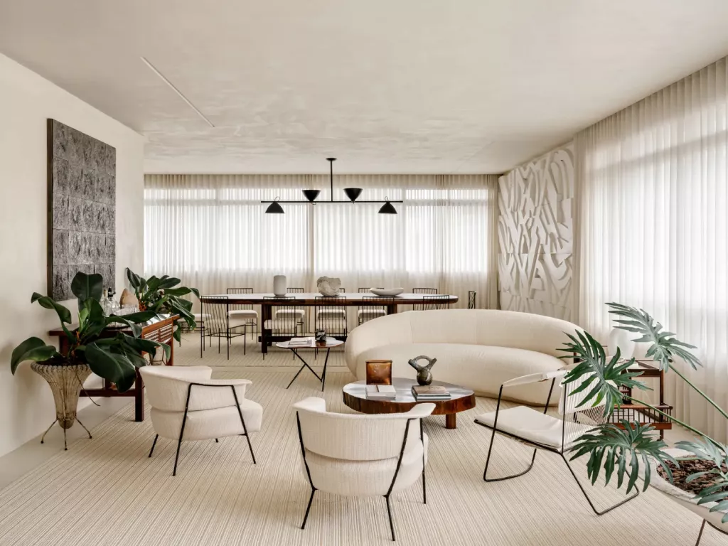
Brazilian design Ulysses de Santi’s São Paolo Home Interior | AD Middle East
- Tactile Layering: The secret to mastering Cloud Dancer in the home is texture. Because the hue is so subtle, the eye looks for depth in the weave of the fabric. Expect to see an explosion of white-on-white layering: heavy bouclé sofas paired with raw linen curtains and hand-knotted wool rugs.
-
- The New Materiality: Cloud Dancer thrives when paired with “honest” materials. It acts as a high-definition filter for the natural world. Designers are using it to highlight the dramatic gray veins in Calacatta marble, the honeyed warmth of untreated oak, and the rugged imperfections of travertine. When set against Cloud Dancer, a matte black steel frame or a brushed champagne gold fixture doesn’t just sit in the room; it pops with architectural intent.
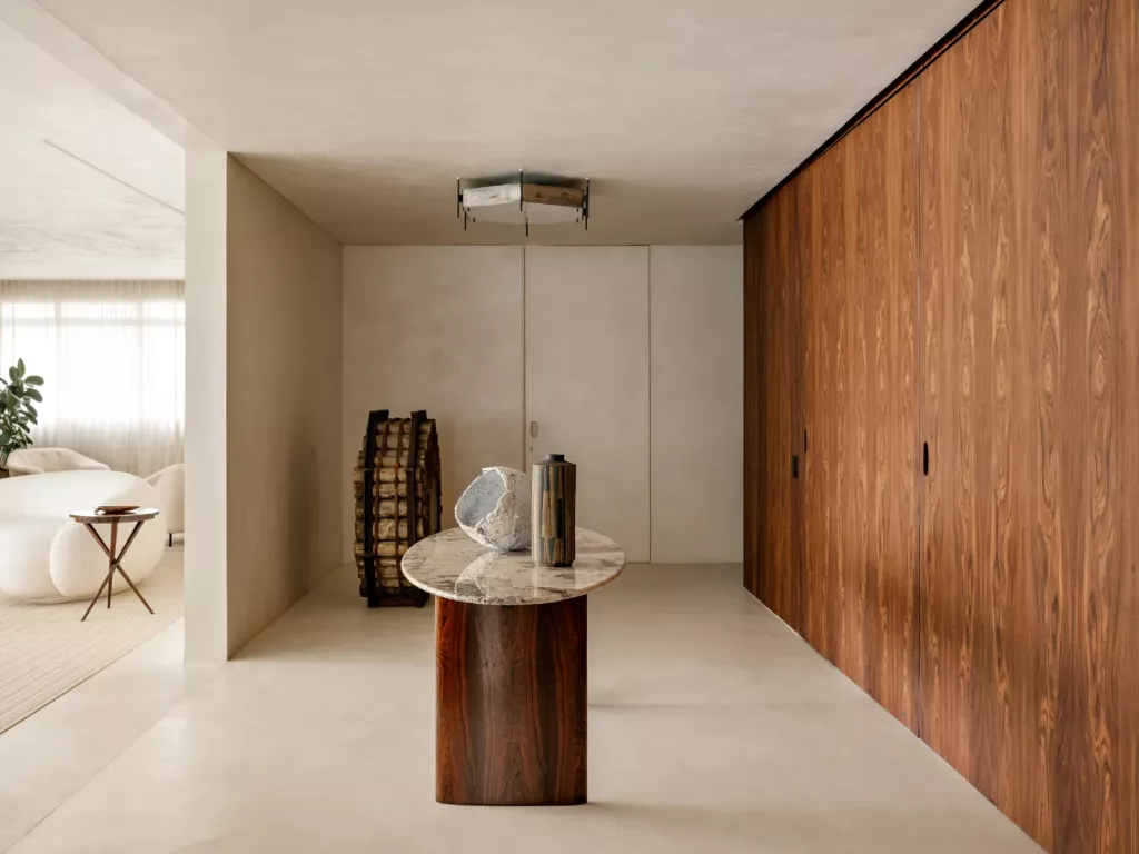
Brazilian design Ulysses de Santi’s São Paolo Home Interior | AD Middle East
- The New Materiality: Cloud Dancer thrives when paired with “honest” materials. It acts as a high-definition filter for the natural world. Designers are using it to highlight the dramatic gray veins in Calacatta marble, the honeyed warmth of untreated oak, and the rugged imperfections of travertine. When set against Cloud Dancer, a matte black steel frame or a brushed champagne gold fixture doesn’t just sit in the room; it pops with architectural intent.
- The Chameleon Effect: One of the most fascinating aspects of Cloud Dancer is its sensitivity to light. In a south-facing room during the “golden hour,” the color absorbs the orange hues of the sun, turning into a creamy, candle-lit amber. Under the cool, blue light of a rainy afternoon, it recedes into a misty, ethereal gray. It is a living color that shifts with the rhythm of the day.
Fashion & Lifestyle
In fashion, Cloud Dancer is the natural evolution of the “Old Money” aesthetic. It’s the color of a cashmere sweater draped over the shoulders in St. Moritz or a diaphanous silk gown catching the breeze on a yacht. Runway trends for 2026 are already leaning into “monochromatic fluidity.” Designers are moving away from rigid structures and toward “aerated” silhouettes, clothes that seem to float around the body. This isn’t the white of a starched dress shirt; it’s the white of a cloud, semi-transparent, layered, and soft.
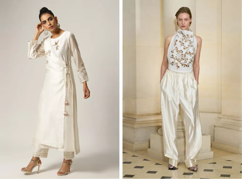
Silk Chanderi Angrakha from Anantaa By Roohi (left) & Carven Spring Collection 2026 ready-to-wear (right) | Vogue
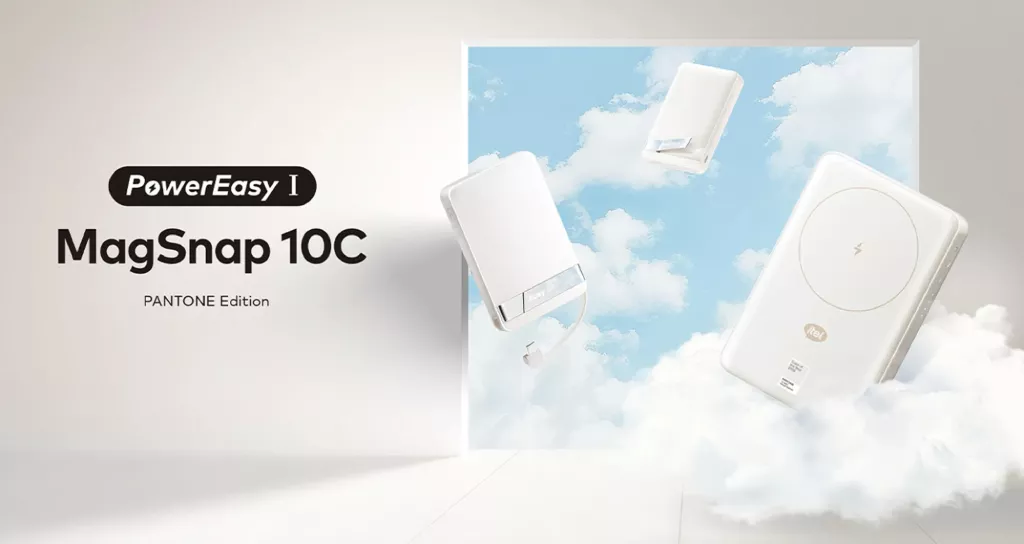
Even the tech world is pivoting. Brands like Itel and Motorola have begun integrating Cloud Dancer into their hardware, moving away from the aggressive “Gamer RGB” lighting and toward devices that feel like lifestyle accessories, objects that blend into the home rather than demanding attention.
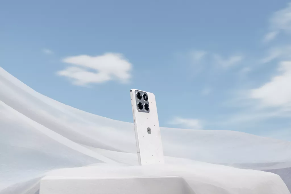
Motorola Edge 70 special edition Pantone Color of the Year 2026, embellished with crystals by Swarovski | Pantone
Itel x Pantone Color of the Year 2026 Special Edition Collection | Pantone
Branding and Sensory Frontiers
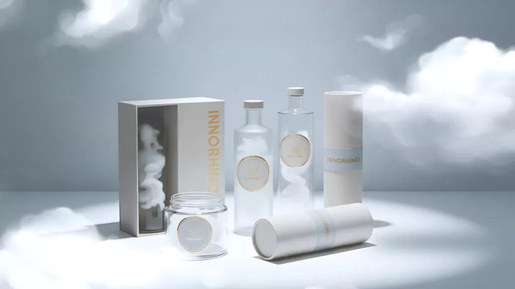
Perhaps the most surprising influence of Pantone 2026 is in the branding world. Austria Juice and Innorhino innovators are forecasting a rise in “white-themed” sensory experiences. We are seeing a move toward a “clean label” aesthetic in beverages & skincare that use coconut water, lychee, white tea, and elderflower to create a flavor profile that matches the visual serenity of Cloud Dancer.
The “Cloud Dancer” Trivia
-
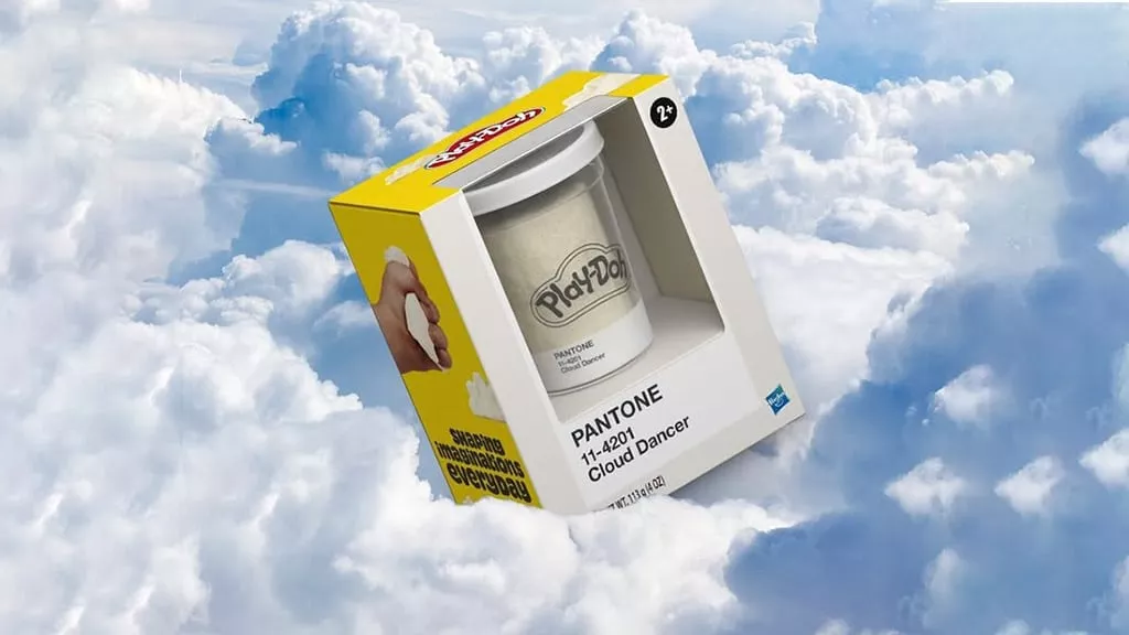
- The Play-Doh Paradox: To celebrate their 70th anniversary, Play-Doh is collaborating with Pantone to release a “Cloud Dancer” white. It’s a poetic move, giving children a literal blank slate to start their creative journeys.
Toy Insider
- The Play-Doh Paradox: To celebrate their 70th anniversary, Play-Doh is collaborating with Pantone to release a “Cloud Dancer” white. It’s a poetic move, giving children a literal blank slate to start their creative journeys.
- A Toast to the Coast: Luxury hospitality groups like Mandarin Oriental are reportedly designing “Cloud Dancer” meditation suites, where the scent (white cedar and jasmine), the sound (white noise), and the sight (11-4201 walls) create a total immersion in tranquility.
TTW
Whether you view Cloud Dancer as a “shrug disguised as a prophecy” or a “quiet emblem of hope,” its impact is undeniable. It challenges the design world to stop relying on the “crutch” of loud colors and instead master the difficult art of subtlety.
References
- https://www.admiddleeast.com/story/pantone-colour-of-the-year-2026-meet-cloud-dancer-the-softest-shade-of-white-yet
- https://www.homesandgardens.com/interior-design/pantones-color-of-the-year-2026-is-cloud-dancer
- https://www.pantone.com/color-of-the-year/2026
- https://www.rioroses.com/pantone-color-2026/
- https://medium.com/@jodiemshaw/why-pantones-2026-color-of-the-year-is-already-out-of-style-
- https://domkapa.com/en/blog/inspiration/pantone-color-of-the-year-2026-5-reasons-to-use-the-cloud-dancer/
- https://indigopaints.com/blog/pantone-colour-of-the-year-2026-embrace-the-serenity-of-cloud-dancer/
- https://www.wallpaper.com/design-interiors/pantone-colour-of-the-year-2026-cloud-dancer-white
- https://www.austriajuice.com/news-blog/pantone-color-cloud-dancer
- https://www.admiddleeast.com/story/inside-a-sao-paulo-home-that-quietly-echoes-pantones-2026-cloud-dancer-palette
- https://innorhino.com/blog/about-design/pantone-2026-color-of-the-year-cloud-dancer-packaging